Color is one of the most expressive elements because it can directly affect people’s emotions and the overall atmosphere of the space. Therefore, the selection and matching of colors in home soft furnishings is particularly important. Today, let’s talk about home color matching and share some matching tips that you can easily master!

01
Color matching of the whole house
For small apartments, you can use cool colors, neutral colors and rising colors to form contrast to make the space look more transparent and larger. Warm colors can create a sense of warmth and are more suitable for use in public areas such as living rooms and bedrooms.
Neutral colors:Black, white and grey.
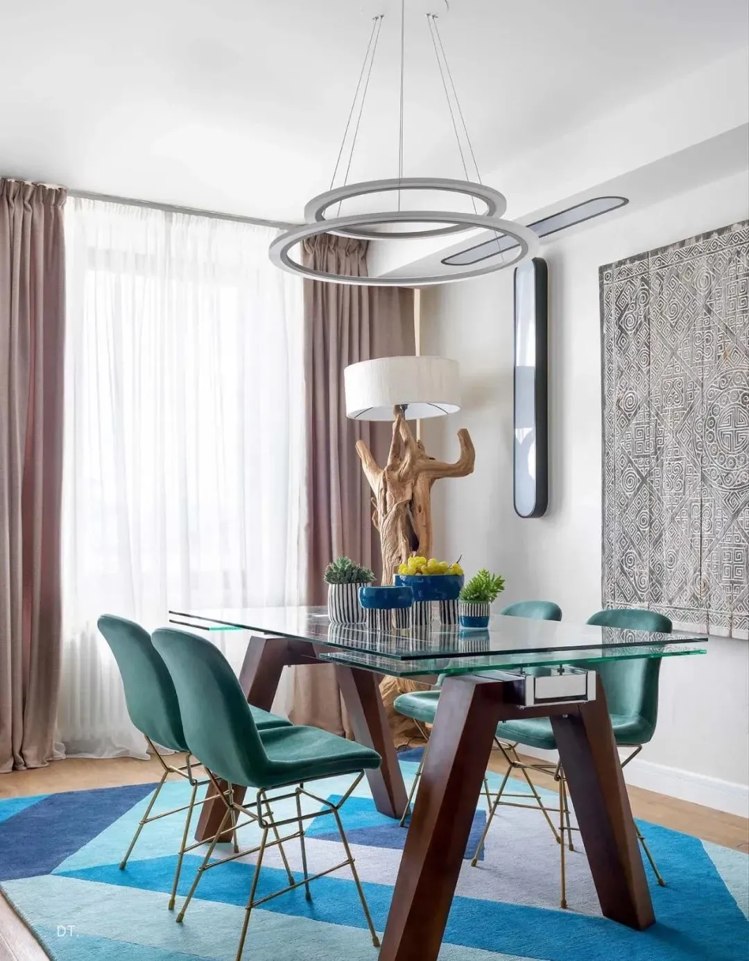
Cool color system:Blue, green, purple, etc. are visually “backward” colors.
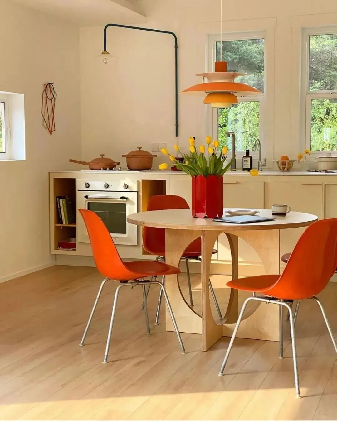
Warm color system:Red, yellow, orange, etc., are visually “forward” colors.
02
Whole house color matching proportion principle
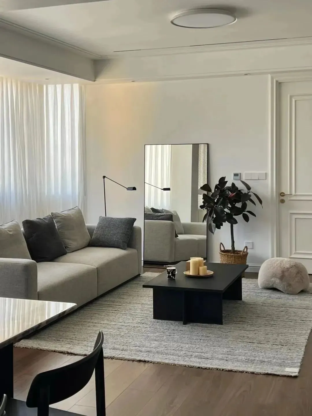
Space color usually consists of basic color, theme color and embellishment color. The recommended color ratio is:Background color: Theme color: Embellishment color = 7: 2: 1
Background color:Including walls, floors and ceilings, it is the background color of the whole home.
Theme color:It mainly refers to the color of furniture and sofa, which makes the space color richer and more layered.
Embellishment color:It mainly includes soft decorations, hanging paintings, lamps, etc., which are used to increase the atmosphere and local color jump.
03
Number and level of color schemes
Under normal circumstances, except black, white and gray, it is best to have no more than three other colors in the same space to avoid being cluttered.
The wall is deep in the ground, the furniture is deep:For example, dark sofas are paired with log floors and white walls.
The wall is deep, the furniture is shallow:For example, light gray walls with gray floor tiles and white sofas.
04
Principles of color matching for soft furnishings
The more single the color, the richer the material:
For most families, it is difficult to use too much color. At this time, different materials can be used to enrich the layers in the same color system, such as combining bright, matte, woven, suede, textured or patterned fabrics, and breaking the monotony of colors with the diversity of materials.
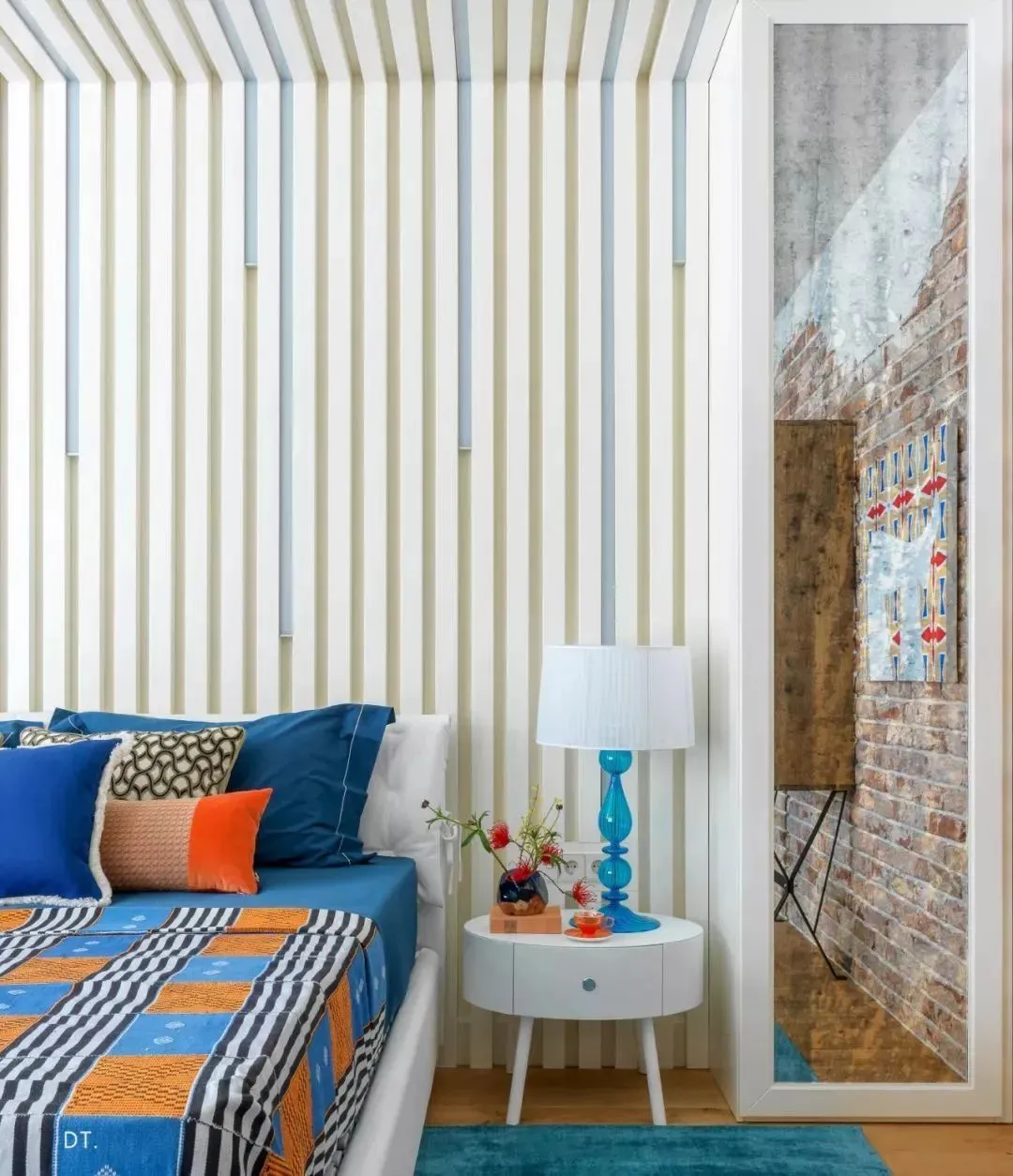
Deep and shallow should be alternated, and where there is deep, there is shallow:
To avoid the sofa blending with walls, curtains and carpets, it is necessary to open the gap between light and dark. You can try to adjust the space photo to black and white mode, and you will find that the clearer the contrast between black and white, the more layered the picture will be.
The color echoes and the degree of completion is higher:
Colors should echo each other, not exist in isolation. You can extend a certain color to pillows and carpets, dining chairs and vases, and even green plants or furnishings. Extracting a certain color in a space and repeating it in different corners often leads to unexpected aesthetics!