Different decoration styles have their own unique color matching characteristics. Now, let’s explore it together!

01
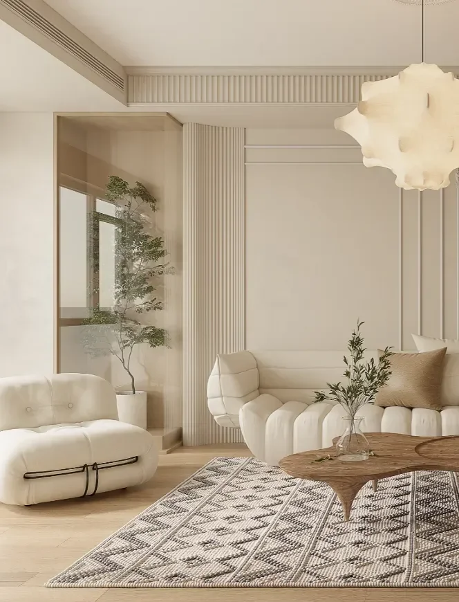
Creamy wind
Cream style is actually a color matching, not a fixed style. Therefore, it can freely blend with Japanese, Nordic, French, modern simplicity and other styles, and collide with different effects.
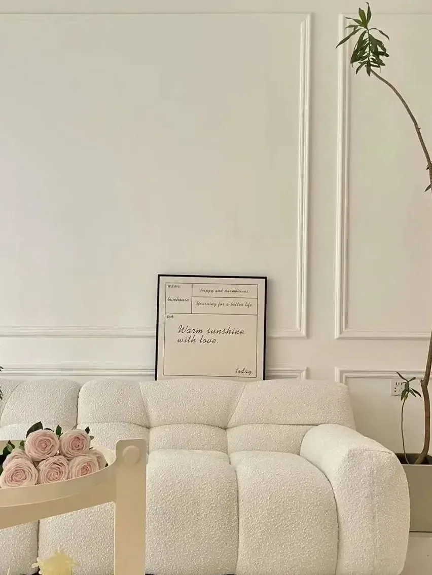
The overall color scheme is mainly light color with low saturation, which is gentle and healing, delicate and delicate, so it is especially loved by girls.
In terms of color selection, you can choose soft colors such as milk coffee color, warm gray, log color, pearl white, protein off-white, etc. to keep the overall space simple and clean.
02
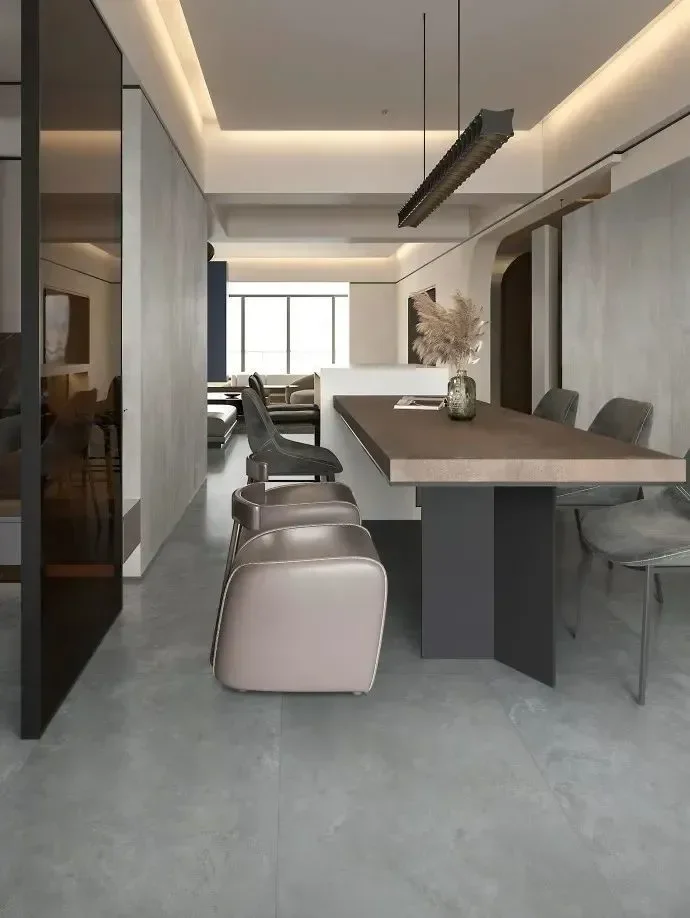
French style
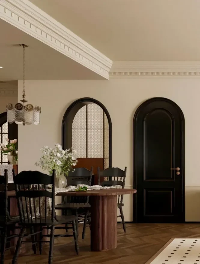
When it comes to French style, people usually think of “elegance, sophistication and romance”. French decoration not only retains the traditional sense of high class, but also blends the relaxation of modern simplicity.
French cream style mainly combines romantic French elements with gentle cream colors and soft clothes. It simplifies the exquisite and complicated carving and pattern lines in traditional French style, and retains the unique romantic sentiment of French style.
In terms of color selection, you can choose milky white, beige and light brown. After blending into the creamy lighting atmosphere and off-white tone, the combination of the two creates a warm and delicate atmosphere, which makes people immerse themselves in it.
French retro style is dominated by romantic elements, pursuing refinement and returning to nature, and its overall temperament is retro and elegant. Combining black, white and gray with French light luxury is born with a sense of high class.
The black texture neutralizes the sweetness of a large area of milky white, adds a sense of rationality and calmness, and just presents a cool literary atmosphere between retro and modern.
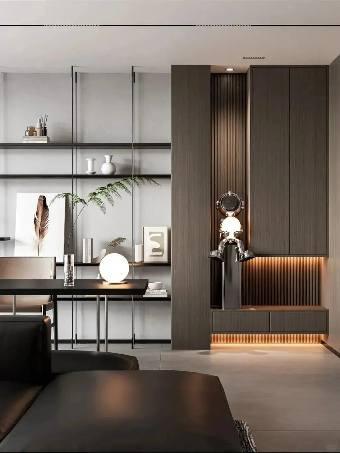
03
Log wind
In the fast-paced modern life, people are increasingly yearning for a natural, quiet and comfortable lifestyle. The simple decoration of logs is the embodiment of the perfect combination of natural elements and simple design concepts.
It emphasizes the design concept of “less is more”, and creates a quiet and comfortable living environment through simple lines and shapes.
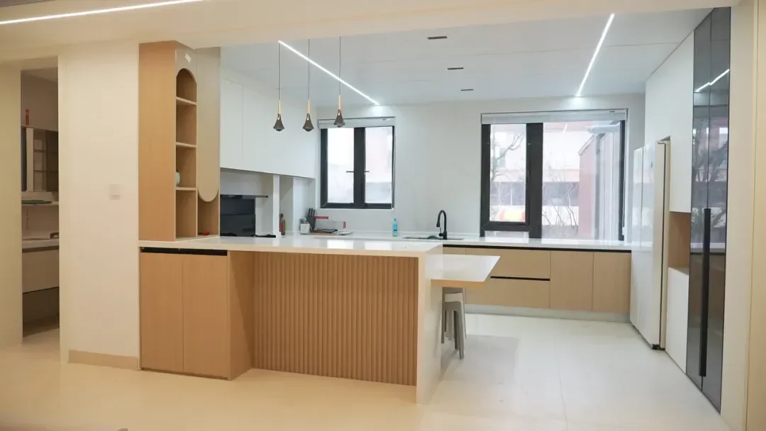
The biggest feature of log style decoration color matching is nature. It features raw wood color as the main tone, paired with other natural tones such as white, beige, etc.
04
Wabi-sabi
The word “wabi-sabi” represents a pure and simple life concept, with a low-key, concise and free and easy temperament. It seems simple or even “worn-out”, but it is the supreme state of aesthetics. The design of wabi-sabi style has distinct techniques and characteristics, and gradually forms a unique charm.
This aesthetic of pursuing authenticity and restraining materialistic desires is displayed in space design-both simple and advanced, and has become one of the popular home styles at present.
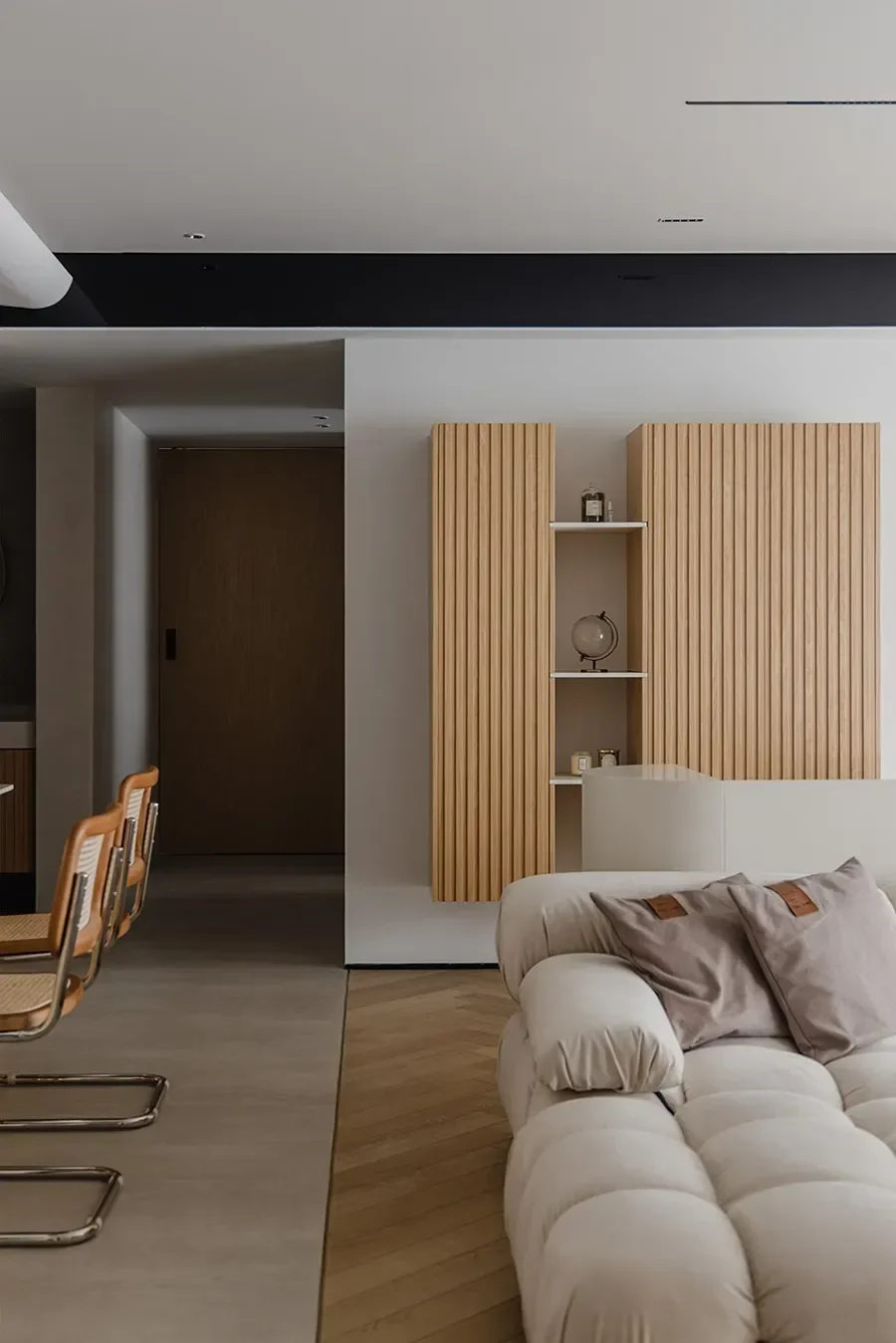
“Wabi-sabi wind” is mainly natural colors, mostly using natural and unique high-grade gray tones, such as flax, stone cyan and sandalwood. Earth color is commonly used as the basic color, and beige and high-grade gray are also common tones.
For example, the wabi-sabi style large flat living room can use earth colors, light gray, light yellow, etc. as the basic colors to create a peaceful and charming visual atmosphere.
Color is an indispensable element in decoration, it can not only affect our mood, but also shape how we feel about the space. Choosing the right color scheme can not only enhance the beauty of the space, but also enhance the quality of our lives.